An RPI chart panel can be used to visually display data in two primary ways.
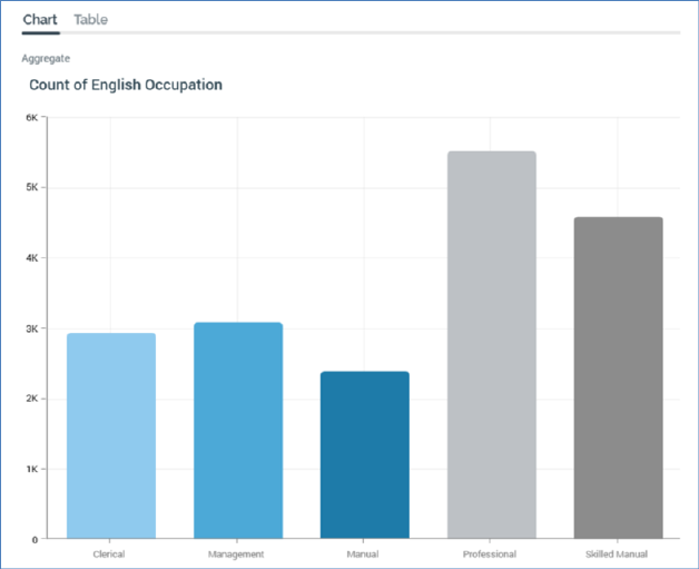
By configuring a chart with a single Attribute, you can refresh it to view a graphical representation of that attribute’s data:
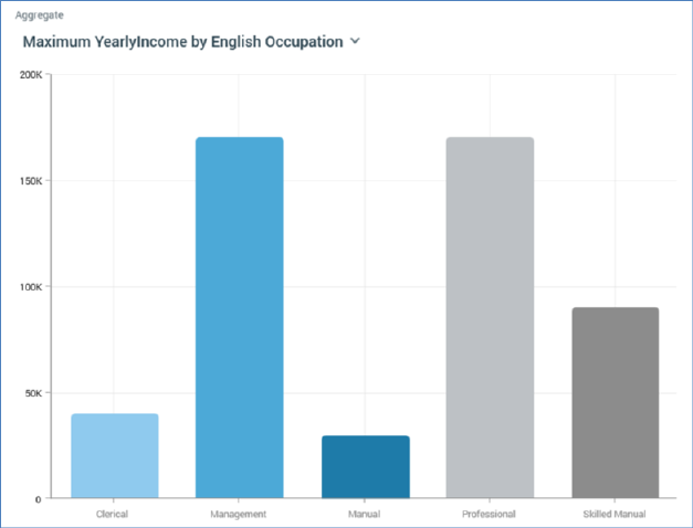
You can also configure a chart with a Function attribute. You can then select from a series of available aggregates. On refreshing the chart, you can analyze how the Function attribute is aggregated against each displayed Attribute value:
A chart consists of the following elements, each of which is documented separately:
•Resolution/Definition
•Toolbox
•Chart Tab
•Table Tab
•Actions Menu