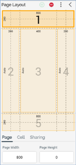
When a grid-based cell layout is selected, the Page Layout section appears as follows:

The following are shown:
•Toolbar – exposing three options and covered separately.
•Cells list: cells are shown below the Page Layout toolbar. Each cell is automatically assigned an ordinal number, which is incremented or decremented as cells are added and removed.
You can populate a cell directly with an asset (other than a web form asset) or smart asset by dragging the required file from the toolbox and dropping it onto a cell. When you do so, any existing content in the cell is lost, and the file's name is displayed below the cell number.

You can also select a cell within the cells grid. When you do so, the Cell Editor section is populated with the contents of the selected cell.
A context menu is shown when you right-click a cell in a grid-based layout, exposing a single option:
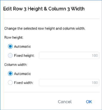
o Edit row/column size: clicking this button displays the Edit Row [y] Height & Column [x] Width dialog:

The dialog allows you to set the following cell properties:
§ Row height: two buttons allow you to specify that the row’s height should be set automatically (in accordance with the overall page height), or to a fixed value. If the latter is selected, you must specify a value, which defaults to 100, and which must be greater than or equal to 50.
§ Column width: as row height.
•Tabset: covered separately.