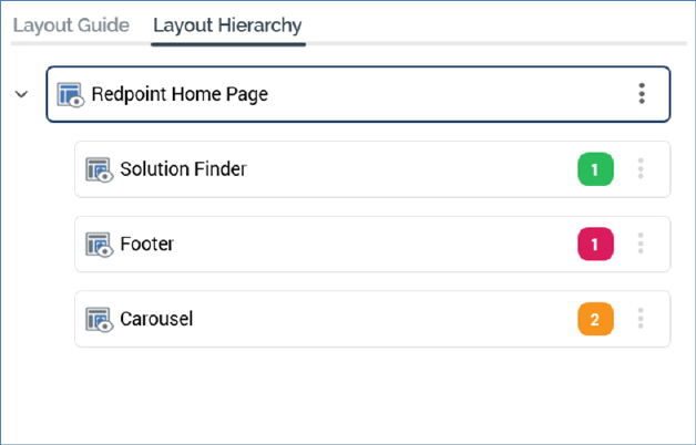
The Layout Hierarchy contains a treeview representation of the current realtime layout's hierarchy of layouts and areas. If the Layout Guide is used, it reflects the structure of layouts displayed therein.

The Layout Guide is read-only. An initial layout is always present.
A tooltip is shown when hovering over a layout or node in the hierarchy, displaying its name and description:

The following appear at a layout or area displayed within the Layout Hierarchy:
•Icon: representing a layout:

...or area:

The icon is adorned with a mini icon in the following cases:


•Name
•'Traffic light': displaying the current status of smart asset publishing at the layout or node. A tooltip is shown when hovering over the traffic light:

The traffic light's color represents the following:
o Green:

o Amber:

o Red:

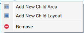
•Actions: this button is displayed at the right of a layout or area. Clicking it displays a context menu, exposing the following options:

o Add New Child Area: selecting this option creates a new area as a child of the current layout or area. It is added after all other children. Its default name is 'New Area' (an incrementable integer can be added to ensure the name's uniqueness within its parent).
o Add New Child Layout: selecting this option creates a new layout as a child of the current layout or area. It is added after all other children. Its default name is 'New Layout' (an incrementable integer can be added to ensure the name's uniqueness within its parent).
o Remove: this option is disabled at the root layout. Invocation removes the selected layout or area without display of an 'Are You Sure?' dialog.
Note that the maximum depth to which layouts and areas can be nested is 10 deep.
The Layout Hierarchy treeview's collapsed or expanded status is saved along when the current realtime layout is saved.
You can drag and drop layouts and areas within the treeview to re-order them. You cannot drag the root layout, and you can only drop layouts and areas in a legitimate position.