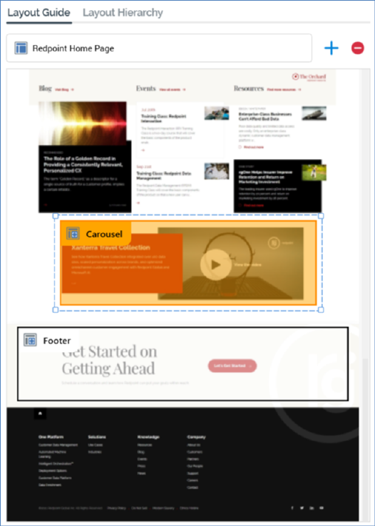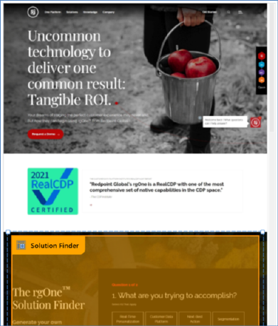
The Layout Guide tab allows you allows you to visually represent a layout. A background image (typically of a web page) can be uploaded, and areas can be located within the layout.

It consists of a toolbar and a Layout control.
The toolbar exposes the following:
•Layout chooser: this control, displayed at the top of the tab, allows you to choose a layout, and the areas contained therein, to view in the Layout Guide. If more than one layout has been configured within the current realtime layout, a treeview is displayed on clicking the layout chooser.

You can select a layout to display in the Layout Guide. The treeview is not shown if only a single layout has been configured.
•Add new Area to this Layout: this button, shown to the right of the layout chooser, allows you to add a visual representation of a new area to the Layout Guide. The new area is positioned below all existing areas within the current layout, is selected automatically and is named 'New Area' (an incrementable integer can be appended to ensure that the area's name is unique within the layout).
•Remove selected Area from this Layout: this button, displayed to the right of Add new Area..., is enabled when an area is selected in the Layout Guide. Clicking it removes the area without display of an ''Are You Sure?' dialog.
The Layout control appears below the toolbar. A representation of the current layout, optionally displaying an image selected at the layout's Choose Layout Background property, is displayed below the toolbar. When an image has not been associated with the layout, and no areas have been added, the following is displayed:

When a layout background has been set, it is displayed as expected:

When an area is selected within a layout, the area's Realtime API Context Path is shown in a tooltip when hovering over the same:

When an area is unselected, it is displayed with a black border and no fill:

On hovering over an area, it is displayed with an orange border and fill:

When an area is selected, it is displayed with a selected item dotted border:

You cannot select more than one area simultaneously. No constraints upon areas' placement are enforced.
If an area represents a smart asset with its Show Area property set to 'Yes', it is differentiated from other areas through use of a smart assets icon:

The smart asset name is also included in the Realtime API Context Path tooltip shown on hover:

The Z-order of areas displayed within a layout is as per the placement in the current Layout Hierarchy, with areas later in the hierarchy displayed over earlier areas.