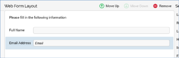
The Web Form Layout section consists of a toolbar and form elements list.
The toolbar is displayed at the top of the section. It exposes the following options:
•Move Up: this button is enabled when an element other than the first in the list is selected. Invocation moves the element up one position in the list.
•Move Down: this button is enabled when an element other than the last in the list is selected. Invocation moves the element down one position in the list.
•Remove: invocation of this option removes the selected element without displaying an ‘Are You Sure?’ dialog.
The form elements list occupies the majority of the Web Form Layout section.
It allows you to specify the form elements that will make up your web form.
When displayed initially, the form elements list contains a message:
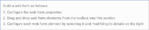
You can drag the form elements you require from the top section of the toolbox and drop them onto the form elements list. You can then customize each element in turn by selecting it and changing its properties in the Selected Element section.
All form element types in the list, other than static HTML or hidden elements, display the label with which they have been configured. If the label property has been set to blank, ‘No label’ is shown (other than at a right-aligned checkbox, where it is not shown at all). Note that labels are displayed in accordance with elements’ Label above field settings.
In addition, and also at all elements other than static HTML or hidden elements, if a field has been defined as required, an asterisk (*) is shown next to its label.
All form elements in the list are read-only. The display of a form element within the list depends on its type:
•Static HTML: static HTML as entered is displayed. No label is shown. The maximum height of a static HTML element within the list is 100 pixels.
•Textbox: a single- or multi-line textbox control is shown (as required). If Placeholder text has been defined, it is shown within the field.
•Radio buttons: one radio button per row in the Values list is displayed, across a single or multiple lines, as required.
•Checkbox: a checkbox is shown, with the label to the left or right as specified. The checkbox reflects the element’s Checked by default setting.
•Dropdown: a non-functional dropdown control, reflecting the first row in the Values list, is displayed.
•List: one checkbox per row in the Values list is displayed, across a single or multiple lines, as required.
•Email: a textbox control, displaying the string ‘Email’, is displayed.
•Date: a textbox control, displaying the string ‘Date’, is shown.
•Hidden: displays the text ‘Hidden [Field name]’.